Ksubaka

Project Background

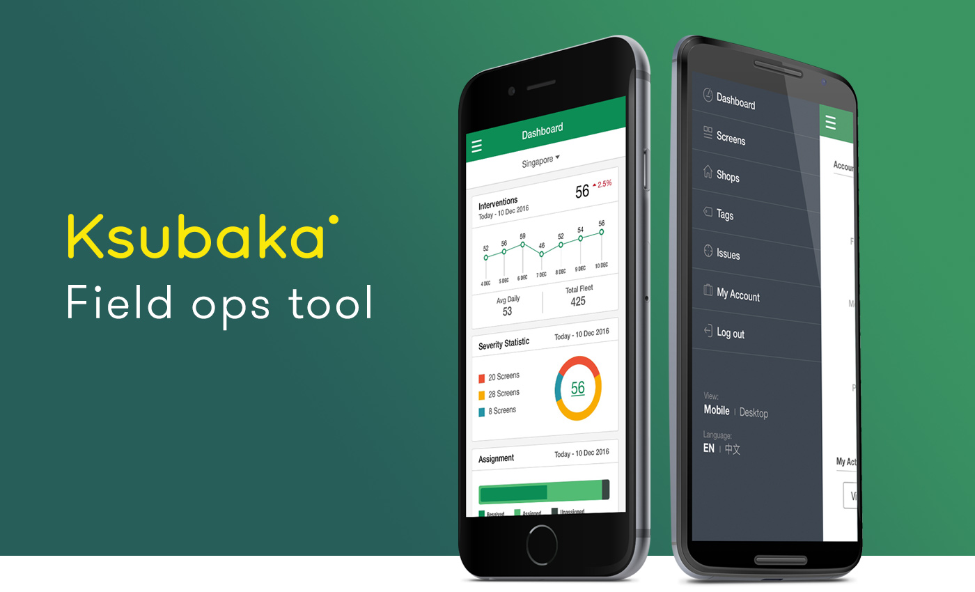
Ksubaka is the world’s first in-store interactive media space that engages customers at the point of purchase through interactive screens that run remotely in the physical store. Field Ops Tool is a mobile-first web app that enables field operators to monitor the fleet of connected screens in real-time and resolves operational issues.

I was the lead UI/UX designer for our internal Field Ops tool, collaborating with developers and stakeholders across Europe to produce the UI and UX deliverables.

The Challenge

In 2015, Ksubaka received 21.5m funds with a vision to roll out more than 20,000 in-store interactive screens in China and Europe. Keeping the interactive screens up-time is critical for our business as it would hurt our key metrics. Field Ops tool was a tool to monitor and help our field operations go around the stores to fix any problematic screens. With the expansion plans, we would require an improved support and monitoring tool to maintain fleet operations as the existing internal tool was too complex and had many usability issues. 

How might we design the mobile platform to enhance usability, without foregoing essential features?

Design Process

The design process consists of 5 key stages – understanding human needs, defining requirements, developing ideas, prototyping the design and finally testing it testing. This phase allows me to break down the project into manageable chunks and define the activities to tackle them.

User Research 

To overcome usual challenges of user research, a constant feedback loop was maintained via an open channel for communications and engagements with end-users. For qualitative research, I conducted in-depth interviews (stakeholders & users) and shadowed our field operators while they were out doing their job. For quantitative research, I studied reports which contain the common issues field operators encounter in the field, so as to understand key features of the job.

Shadowing The Users

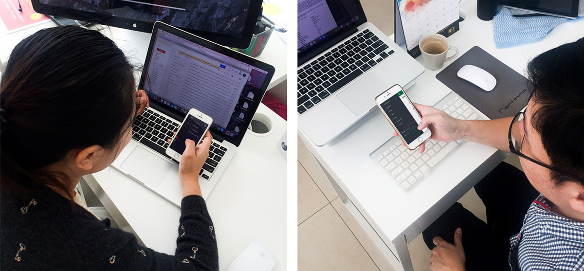
User shadowing proved most effective in understanding users’ behaviour. I followed the field operator in his natural environment and watched them carry out their tasks and confirmed the hypothesis that I had of the situation. Apart from observing, I also performed the tasks myself to gain empathy with the user.

Synthesising Research Findings

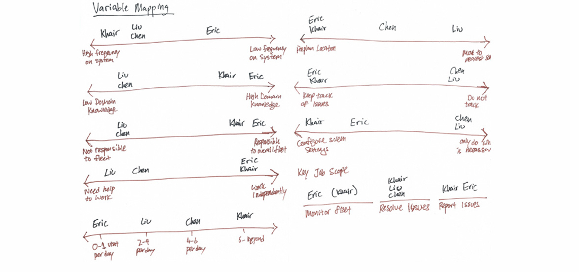
To synthesise the findings, I created a variable spectrum to map users’ behaviour, attitudes and goals to identify commonalities and differences among them. From a pile of unorganised notes, I was quickly able to segment the findings which fed into the personas.

Persona Development

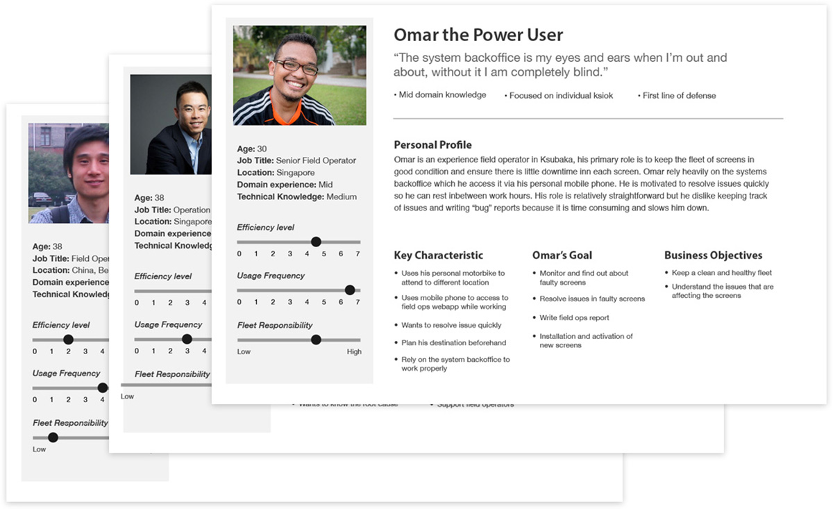
With the synthesized findings, I started developing the personas, which was an effective tool to inform our design decisions and build empathy within the team. Based on the segmentation, we created 1 primary persona and 2 secondary personas – which was useful for feature prioritisation.

Ideating From Persona

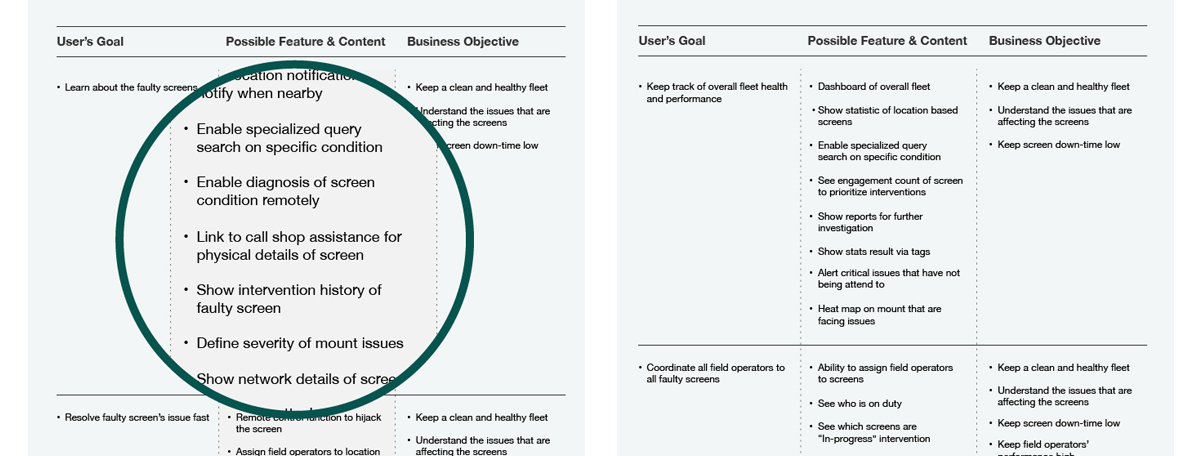
To make personas an explicit part of the brainstorming process, the user’s goal, the business objective, and the potential feature and content were placed side-by-side. This structure ensured that ideas generated would link back to the user and business needs.

Experience Mapping

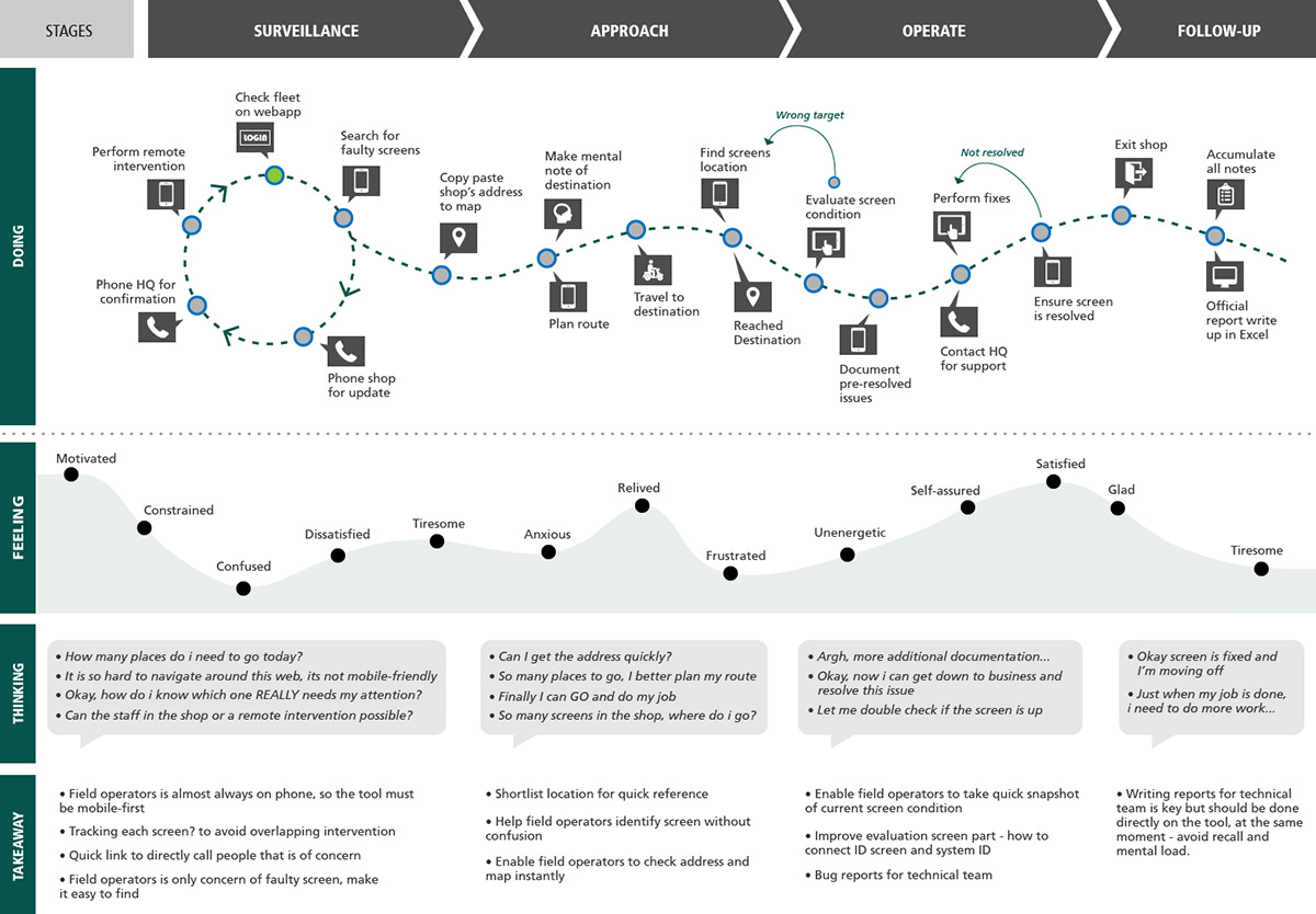
With each persona vividly developed, I began to map their experience of the job. While the persona depicts distinct characteristics and behavioural tendencies, the experience map plays out these behaviours sequentially. This helped the team visualize the end-to-end experience and flow of the current app, so as to identify opportunities for innovative enhancements.

User Scenarios

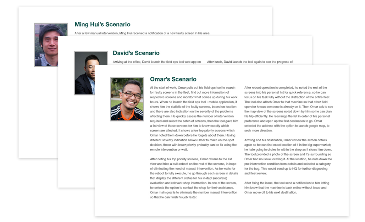
In addition to journey mapping, user scenarios allowed the team to imagine the interaction between the personas and the product in plausible circumstances. The key to a good scenario is by giving the persona a backstory, contextualizing his need, and specifying knowledge gaps that might lead to interaction difficulties.

Scoping requirements from Scenarios

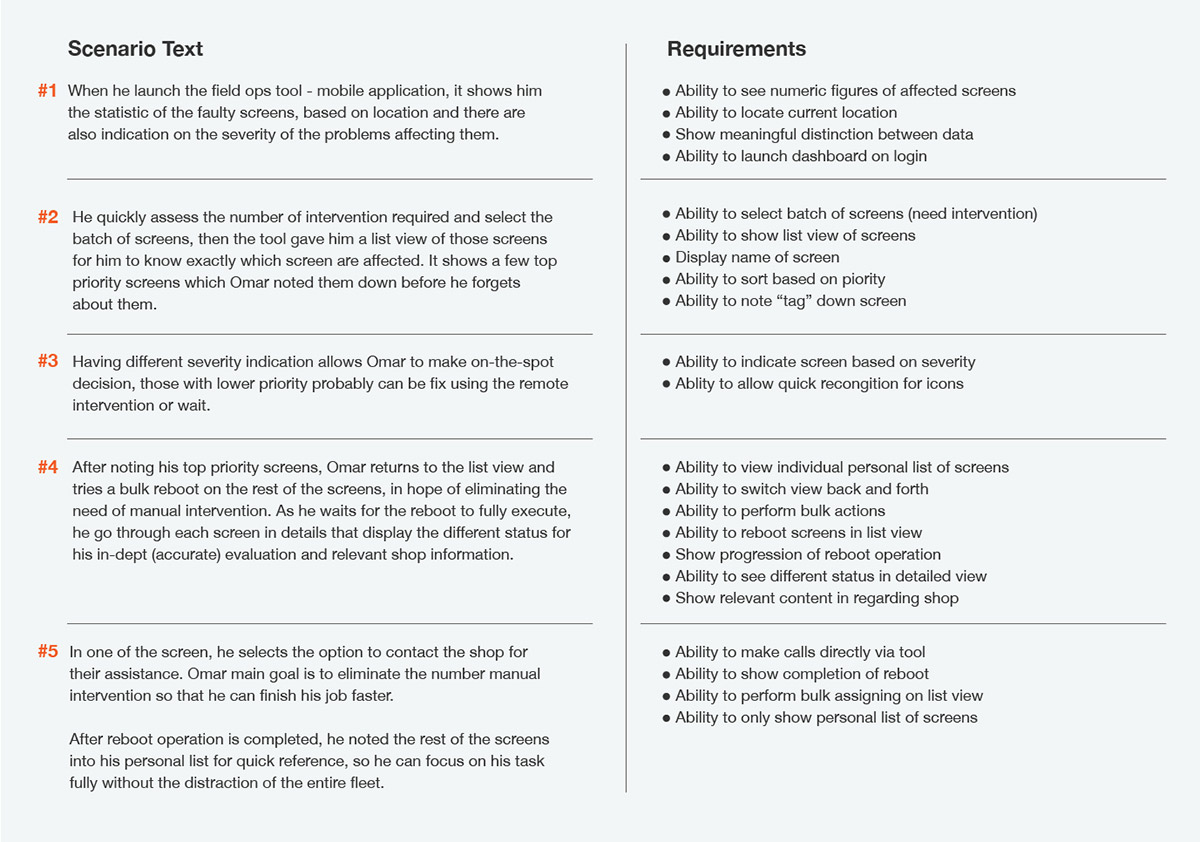
The key outputs of these scenarios were requirements for the product. I highlighted relevant parts of the scenario in a table and brainstormed related requirements alongside it.

Key task flow

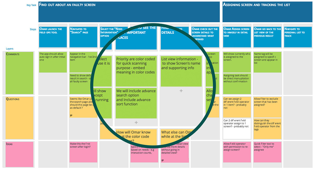
With the ideas gathered, we mapped the potential features into a task flow. This was a highly collaborative effort, with multiple rounds of brainstorming, generating ideas, and challenging existing concepts with the team.

Sketching the UI

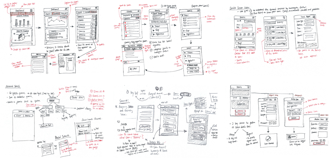
To keep things light and flexible, I started to explore the different ways to fit the functional and data elements on paper. The process of sketching helped with idea generation and possible representation of various functionalities and content.

Structuring the experience

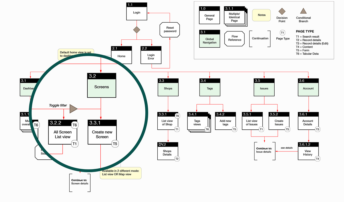
While I adopted Jesse James Garrett’s visual vocabulary to describe the information architecture and interaction design of the app. This method turned out to be too complicated for the team’s liking and makes collaboration difficult. Lesson learned, UX is a team effort and to get buy in from the team, I believe a simple site map would suffice.

Mid fidelity wireframes

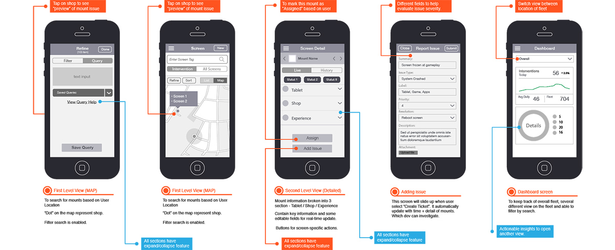
With all the requirements locked in, I created wireframes with annotations describing the interactions. Visualising the requirements into actual pixels quickly revealed initial flaws in the interactions, allowing for quick iterations and enhancements. This document was also shared with the team, ensuring alignment after a few iterations.

Prototyping and usability test

I began working on the visual design after the wireframes were finalized. Because the ultimate priority of the app was functionality rather than complex animation, Invision was the perfect tool for rapid prototyping of the initial designs.

Once the prototypes were developed, I began to conduct usability testing. Notwithstanding minor design flaws, every user was able to complete the tasks. This validation gave the team assurance and confidence to begin development work.

Visual Design – Cloud mapping 

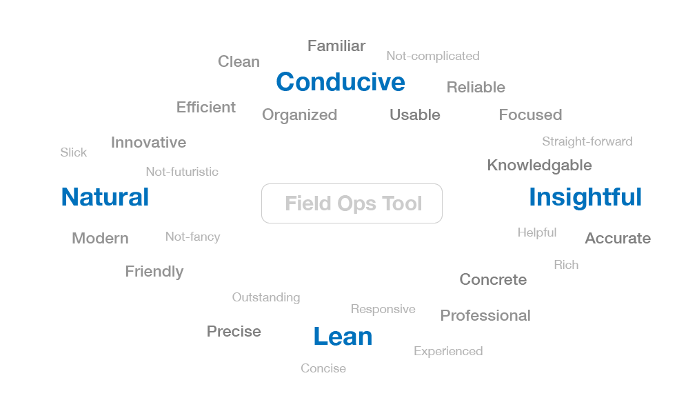
Once we finalized the interaction design, I began the visual design process with cloud mapping technique to define the experience attribute in order to guide the visual decision. The cloud map contains visually-oriented adjectives that describe the message or personality the product should convey.  

The Final Design

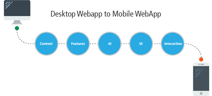
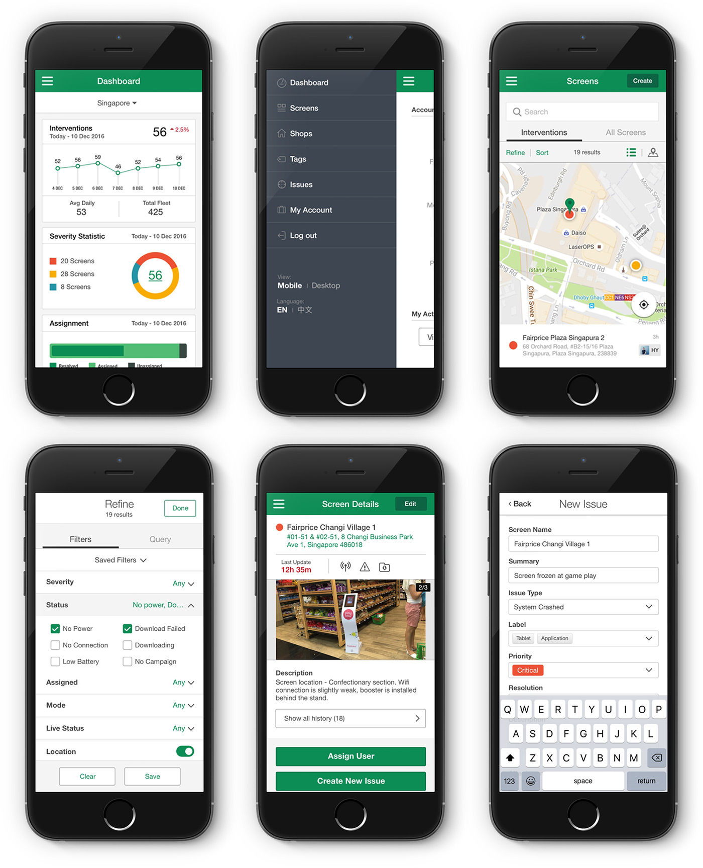
The final output is a mobile web app which enabled the business to monitor the fleet, set up new screens and resolve fleet-related issues. With this improved backoffice tool, Ksubaka was able to scale from 200 to 5,000 screens internationally (at the time of writing), with minimal overhead on fleet operations.

  • The dashboard provides a real-time high-level overview of data that allows discovery of actionable trends and monitor the uptime of the fleet.
  • The overall IA displays key information progressively to minimise cognitive load; the information flow helps field operations to quickly understand/decide what to do next.
  • ‘Assign’ feature helps managers and field operators to coordinate trips to maximise efficiency.
  • ‘Create Issue’ feature eliminates the need for excel sheets, allowing field operators to spend more time focusing on the fleet.