Trade Finance

Overview

Forty years ago, trade finance was characterised by institutional giants, burdened by obsolete systems and manual processes. The lack of scalability and adaptability often resulted in higher operational costs for financial institutions.

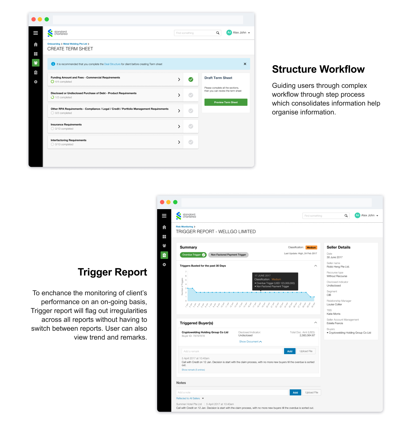
With technological advancement, trade finance is going through a revolution, transforming traditional players and the way they work. Standard Chartered tasked us with the mission of transforming their client onboarding and monitoring process.

My Role

As the lead designer, I oversaw the end-to-end user experience of the product. Working with a cross-functional team, consisting of Product owners, Scrum master, Business analysts, Developers and Testers, I pulled together various ideas and perspectives to deliver a collective solution. The application launched across 3 countries within the institution in October 2017, after 6 months of product development.​​​​​​​

The Problem

Given the immense complexity of trade finance, our key task was to digitalize these processes without losing the nuances. We wanted to create a product that would ultimately reduce effort and time taken to onboard new clients and manage client’s portfolio.

High level objectives:
1. Streamline and automate burdensome processes to reduce overhead cost
2. Digitalize the management of portfolios and risk monitoring
3. Develop a centralised platform to manage customer relationships

The Approach

“No deliverables for the sake of deliverables, better collaboration and quick decision-making based on feedback”

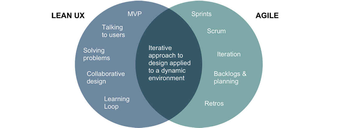
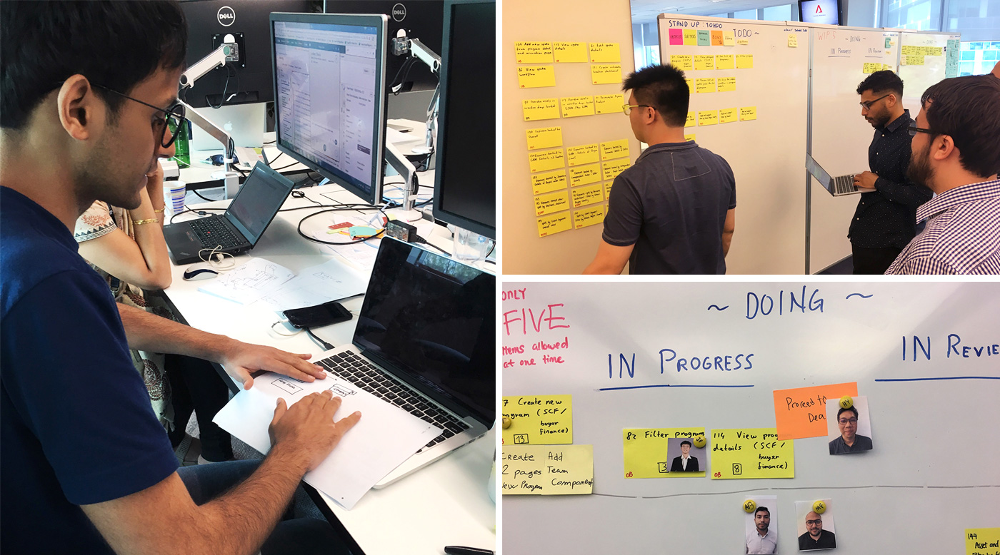
I adopted lean UX principles to complement the agile-scrum process used by the development team. This integration helped us achieve better collaboration through co-designing and quick decision-making based on feedback. Given that the development ran in cycles, the design process ran in a non-linear loop whenever a sprint starts. I went through a constant cycle of requirements, design, testing, detailed specs and handoffs.

KICK OFF

Inception workshop

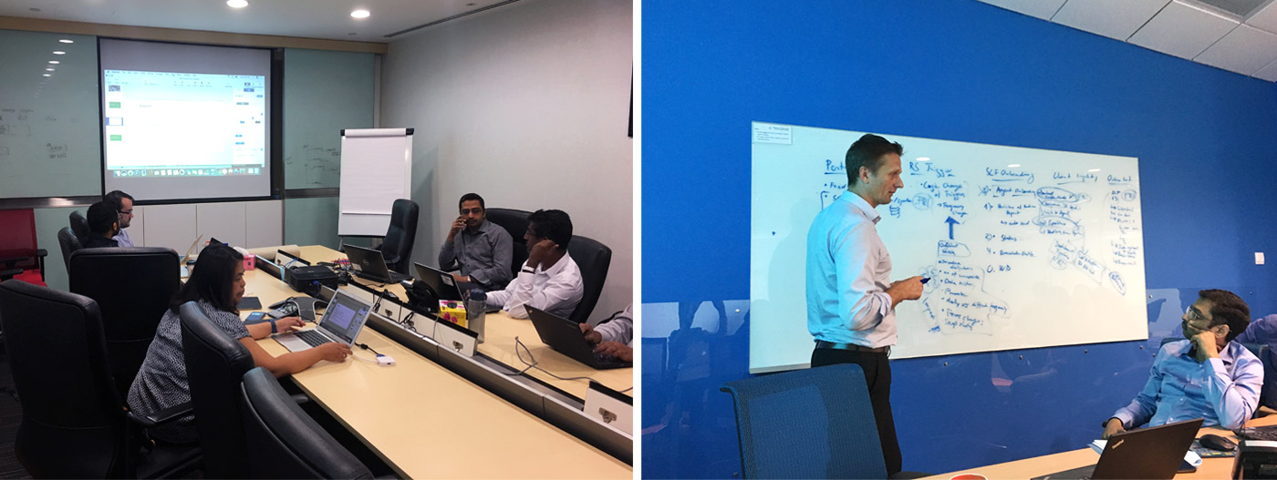
We kicked things off with a 2 weeks inception workshop to define the product goals, vision, roadmap, and to align stakeholders. The information gathered from the workshop offered an early opportunity to deepen our knowledge of the project, which was used for further exploration during my design process.

KICK OFF

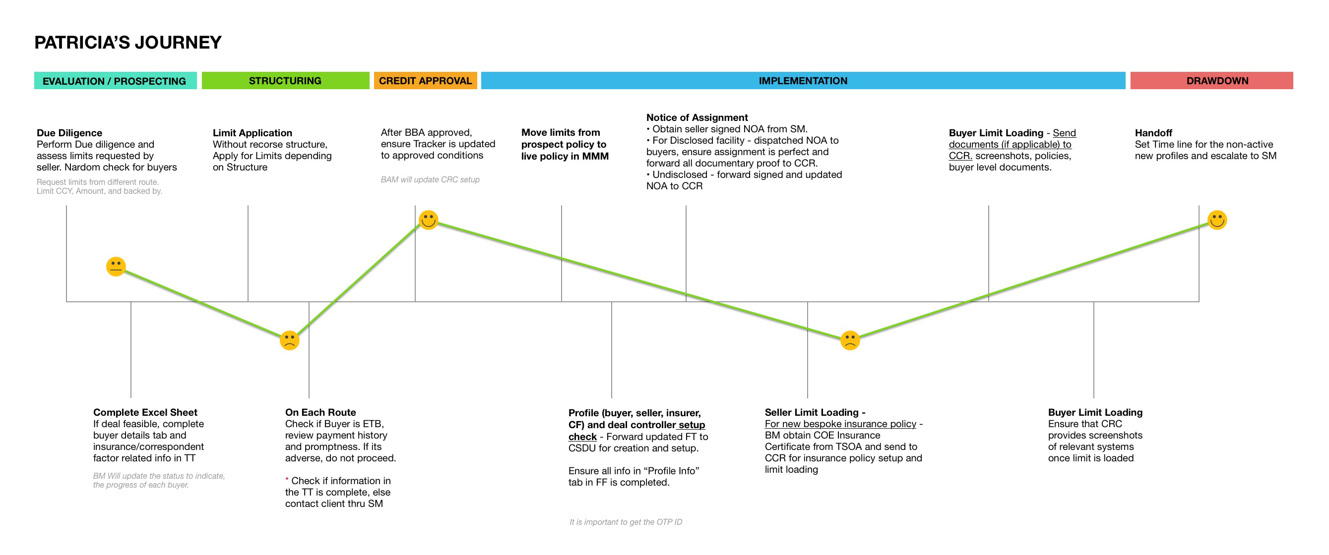
User Journey Mapping

As a starting point for building user centricity, we worked with our stakeholders to map out the typical user journey of the client onboarding and portfolio monitoring process. This technique helped the team understand the big picture and identify different challenges and opportunities for design from a user’s point of view.

DISCOVER

Research Plan

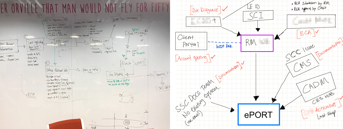
Stakeholder Interview: Tapping into the knowledge and experience of stakeholders (project sponsors) to understand business needs and how things operate within the bank, I conducted interviews with different stakeholders to understand their perspectives and acquire domain knowledge. To make the interview more interactive, I often asked the interviewees to draw out schematics diagrams during the session.


User Interview: The primary goal of user interviews was to understand the current workflow of the users in the team – what worked, what didn’t? What was enjoyable, what was not? What are the needs and challenges that each user faces? How do users communicate with other departments during the process?


Desk Research: There was a lengthy process of documentation of existing workflow artefacts (e.g. excel sheet, physical forms). These artefacts offered key insights on the overall business processes. This research was beneficial for building up domain knowledge and understanding the context.


Landscape Analysis: A quick method to get ideas quickly was to look at similar products and learn from their strengths and best practices. I analysed relevant features of existing products to see how these elements can be retrofitted and incorporated into our product.

SYNTHESIS

Key Insights

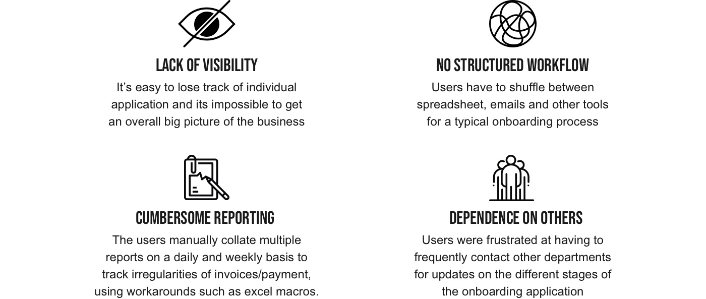
After speaking to users, subject matter experts and other stakeholders, I identified key themes around the common challenges in the workflow. These key insights were prioritised and crucial in shaping the MVP:

SYNTHESIS

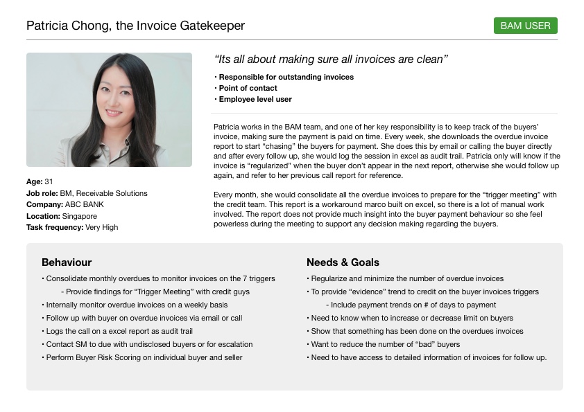
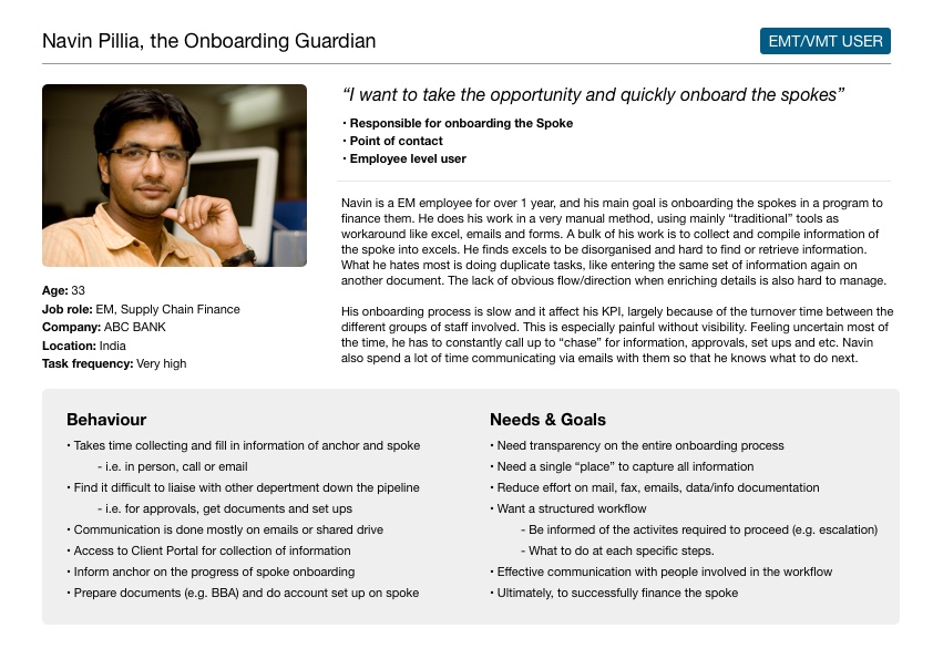
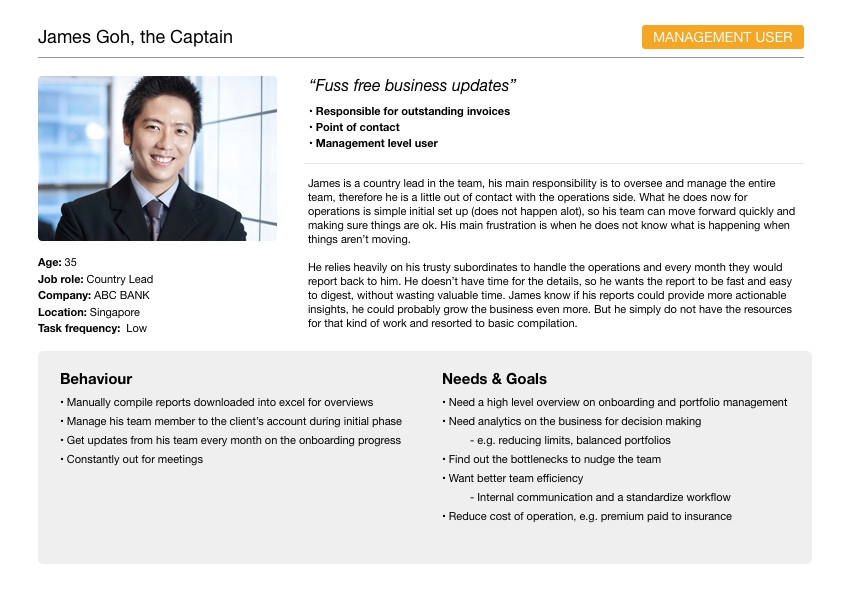
User Personas

I came up with 3 user archetypes that capture the different needs and behaviours. These personas allowed us to quickly refer to key insights about the user during ideation instead of digging through our notes. Having these personas also allowed the team to develop empathy with the users of our products.

SYNTHESIS

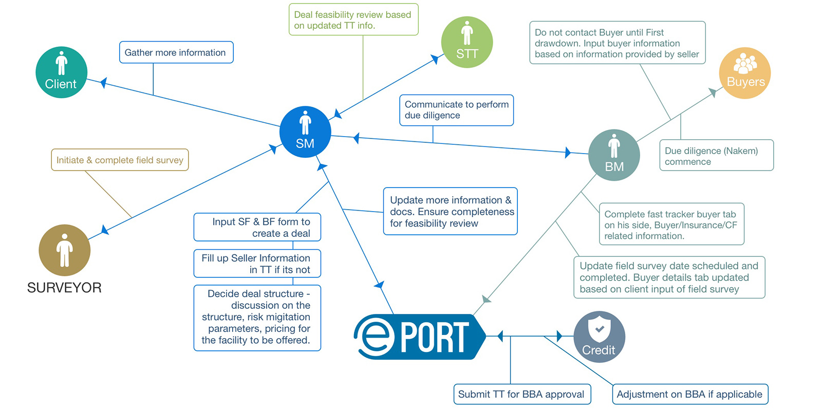
Flow Model

To understand the user’s work domain, I developed a flow model to capture all the existing interactions within the workflow. The flow model illustrated the existing networks and communication patterns of the organisation. After analysing the existing model, I created the envisioned flow model for a superior alternative to getting work done.

IDEATION

Revisiting The User Journey

Due to the complexity of the process workflow, it was important to ensure that the process was captured accurately. I thus mapped the user journey again to validate and deepen my understanding of the experience in an easy-to-digest visual format. Each journey is tied to a persona, and includes moments of highs and lows to identify areas of improvements or opportunities.

IDEATION

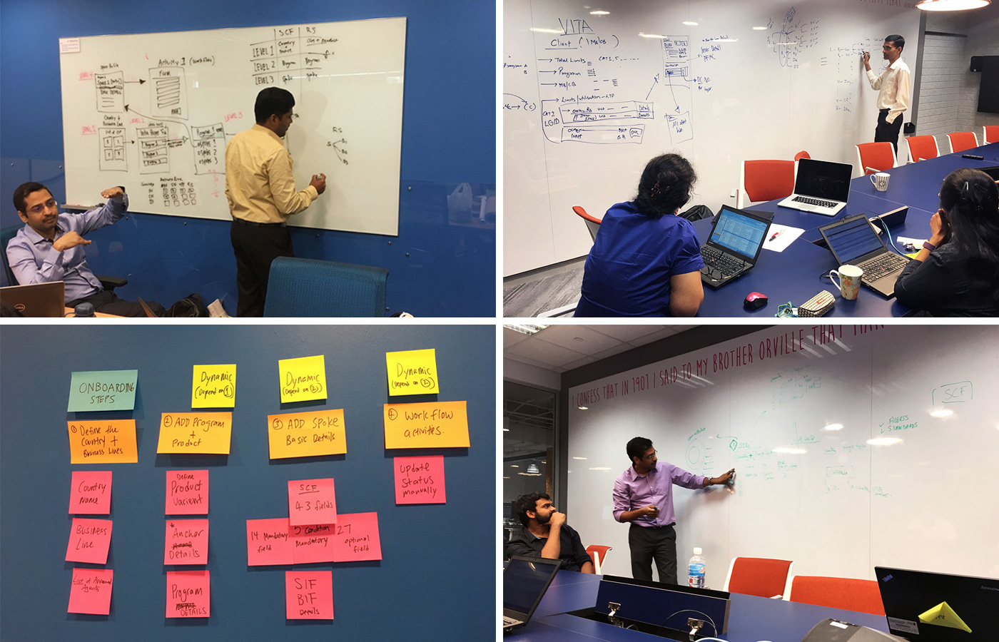
CO-CREATION SESSIONS

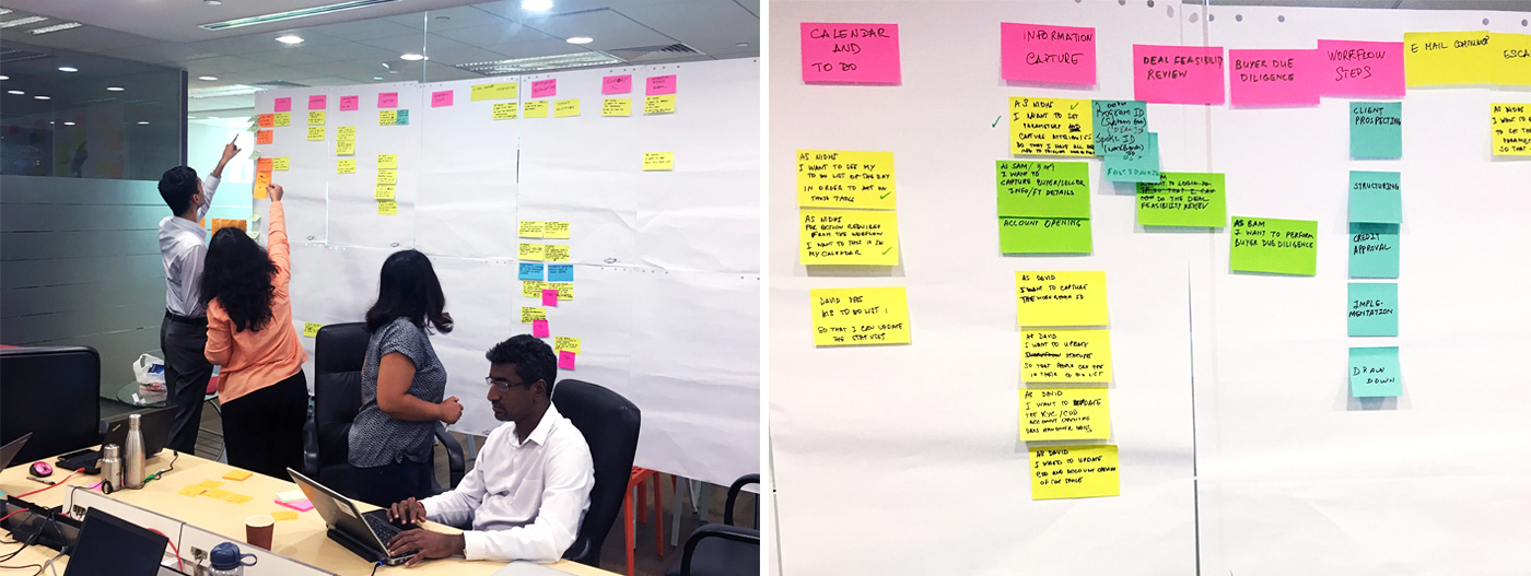
We brought stakeholders and sometimes users into the same room to discuss the problems and brainstorm potential solutions for specific stories before the sprint began. This process involved a lot of whiteboarding and fast-thinking, as well as extensive communication and collaboration. These sessions helped to kickstart concept development and early alignment for the vision.

IDEATION

System Thinking: The Bigger Picture

By mapping out the product’s role in the larger system, it was easier for us to start asking how we can make the system simpler and better. This helped us design the perfect fit for the existing working environment as we’d consider every element in the infrastructure. In the end, we designed the system that would automate different parts of the process (and solve many problems), by connecting to existing tools.

FRAMEWORK DEFINITION

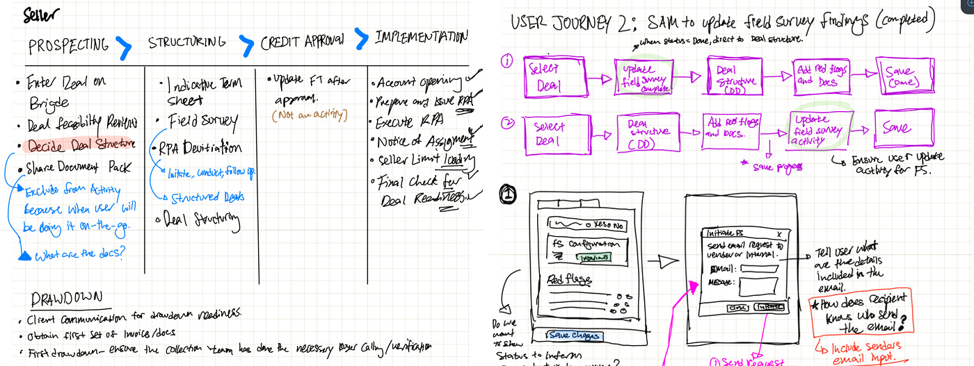
Designing Task Flow

Once we had the big picture, I focused on the specific interactions by drawing out the steps user would take to complete the task. This method allowed me to quickly envision the step by step interaction and understand whether or not our product accommodated the user’s needs and expectation, or if we could streamline it further.

FRAMEWORK DEFINITION

Sketching The Flows

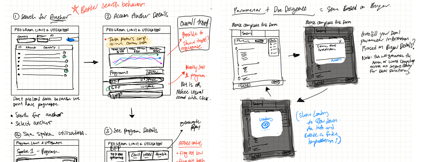
Once the task flow was completed, I began sketching to stimulate ideas and solutions on a UI level. I sketched a few variations to explore the various design alternatives for each flow before developing further. These sketches were often used to test our design concepts as we could quickly get feedback for improvements.

FRAMEWORK DEFINITION

Collaboration Through Wireframes

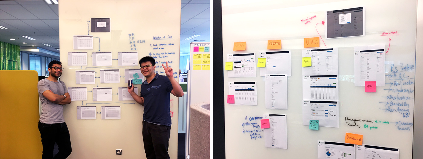
Following the series of sketches, I created higher fidelity wireframes and pasted it on our wall. The team could see a literal map of screens, which depicted the flow and content. Developers were able to understand what they needed to build and often times we made real-time iterations on the wireframes.

EVALUATION

Rapid Prototyping & Validation

Prototyping was done ranging from low fidelity to high fidelity design, often patched together using the Invision tool to test the flow, interaction and content. Design walkthroughs, team evaluation & critique, as well as usability testing were just some of the methods used to elicit feedback from users and test our assumptions.

Design walkthrough and evaluation
Usability testing
DESIGN

Design System

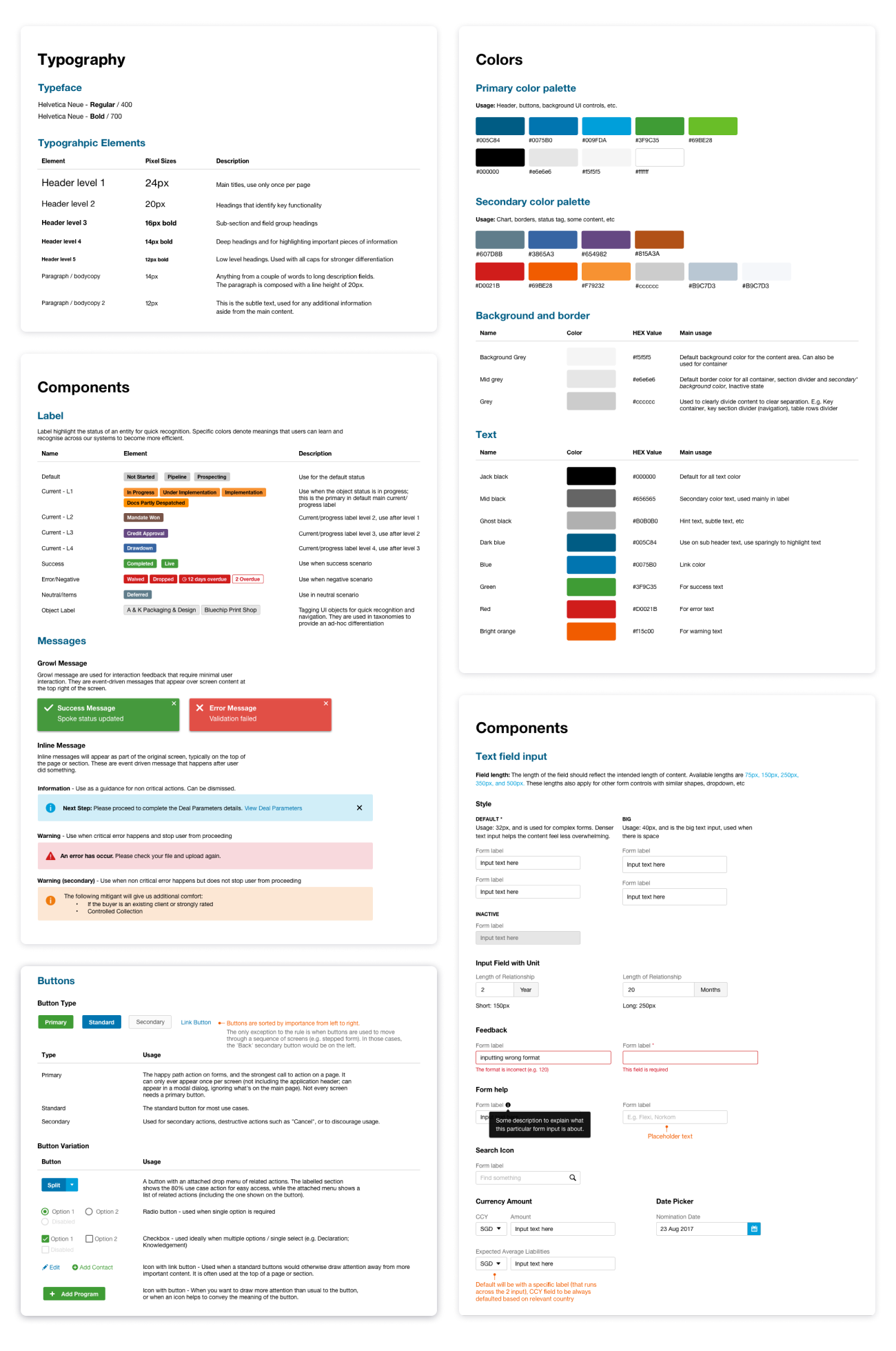
The UI components was growing rapidly due to the design output required to meet deadline. Thus I created the design system to ensure the design language is cohesive and to booster productivity through the reuse of components to avoid reinvention.

The Outcome

The project was a success and the platform has garnered a lot of interest throughout the organisation, including from the CEO of the institution. To measure the outcome, we conducted 15 follow-up interviews with end-users and stakeholders. The general consensus was that their onboarding and monitoring process has improved significantly; the onboarding time reduces by 40%, from 6 months to 3.5 months, and the process became much more efficient and easier to navigate.

SUCCESS FACTORS

Cross Functional Collaboration

For my UX practice more collaborative, I looked for opportunities to work in real time with other people (Devs, BAs, PO) in the team. This is achieved via quick prototyping/sketching during discussion for a particular user story. It was really important to work closely with the team so as to draw inspirations from one another and effectively combine the design, engineering and business aspects of the final solution.

SUCCESS FACTORS

Agile Retrospective via Design Thinking

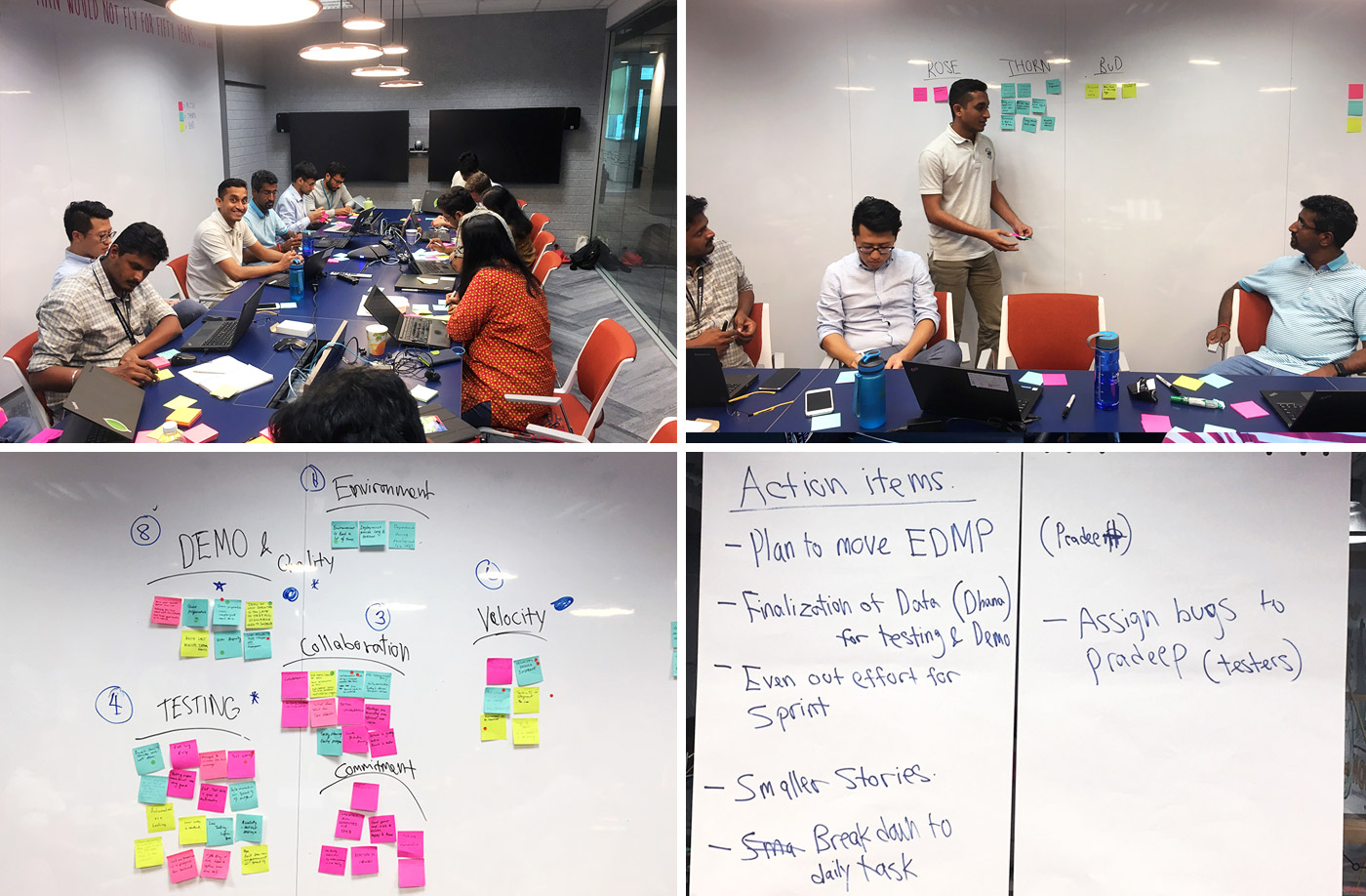
It was not easy to work with such a huge product team as we had close to 15 members. There were bound to be complications. To better improve our product development, I ran a design thinking workshop to help us generate ideas and team alignment. Based on the identified topics, we did Rose, Bud, Thorn, Affinity Mapping and Dot Voting to generate data which provided actionable outcome.